
Executive Development Programme in Creating Mobile-First Websites for All Devices
Learn to design and develop mobile-first websites that ensure optimal user experience across all devices, enhancing reach and engagement.
Executive Development Programme in Creating Mobile-First Websites for All Devices
Programme Overview
This course is for managers, developers, and designers looking to enhance their mobile-first web development skills. First, you will learn the newest trends and techniques in mobile-first web design. Then, you will gain hands-on experience in creating responsive websites that work seamlessly across all devices.
Moreover, you will understand how to optimize websites for performance and user experience. Finally, you will learn best practices for testing and deploying mobile-first websites. By the end, you will be able to lead projects that deliver exceptional mobile experiences.
What You'll Learn
Ready to lead the digital revolution? Join our 'Executive Development Programme in Creating Mobile-First Websites for All Devices'. First, master the art of responsive design. Then, dive into the latest mobile-first strategies. You'll learn to create seamless user experiences across all devices. Further, you'll explore cutting-edge tools and technologies. Additionally, gain insights from industry experts. In turn, you'll boost your career prospects. Graduates often secure roles as UI/UX designers, web developers, or digital strategists. Most importantly, you'll join a vibrant community of professionals. Above all, you'll be at the forefront of digital innovation. Don't miss this opportunity to transform your skills and career. Enroll now and shape the future of web design!
Programme Highlights
Industry-Aligned Curriculum
Developed with industry leaders to ensure practical, job-ready skills valued by employers worldwide.
Globally Recognised Certificate
Recognised by employers across 180+ countries as a mark of professional excellence.
Flexible Online Learning
Study at your own pace with lifetime access to all course materials and updates.
Instant Access
Start learning immediately — no application process or waiting period required.
Constantly Updated Content
Stay ahead with the latest industry trends, best practices, and emerging insights.
Career Advancement
87% of graduates report measurable career progression within 6 months of completion.
Topics Covered
- Introduction to Mobile-First Design: Understand the principles and benefits of mobile-first design philosophy.
- Responsive Web Design Fundamentals: Learn the basics of responsive design techniques for various devices.
- Advanced CSS Techniques for Mobile: Explore advanced CSS features for creating responsive layouts.
- JavaScript for Mobile Enhancements: Learn how to use JavaScript to enhance mobile user experiences.
- Performance Optimization for Mobile: Optimize website performance for fast loading on mobile devices.
- Testing and Debugging on Mobile Devices: Master the tools and techniques for effective mobile testing and debugging.
Everything You Get With This Programme
Key Facts
Audience:
This program is crafted for professionals eager to learn and enhance their skills in mobile-first website creation.
Ideal participants include web developers, designers, and managers aiming to stay current with industry trends.
Those who are interested in learning about responsive web design are welcome to join.
No prior experience in mobile-first design is required.
Prerequisites:
Participants should have a basic understanding of HTML and CSS.
Familiarity with web development tools is beneficial, but not mandatory.
Bring a laptop or tablet.
Outcomes:
After completing the program, participants will effectively apply mobile-first principles to web design.
You will learn how to ensure seamless user experience across all devices.
Participants can design and create responsive websites and web apps.
This program will also highlight the importance of mobile-first design in modern web development.
Ready to Advance Your Career?
Join thousands of professionals who have transformed their careers with LSBR.
Enroll Now — $199Why This Course
Firstly, this program teaches you to design websites that work on all devices. This means you’ll be in demand. Companies want websites that work well on smartphones, tablets, and computers.
Next, it focuses on mobile-first design. This approach prioritizes mobile users. Many people browse on their phones, so starting with mobile ensures a great experience. Plus, it makes your website faster and easier to use.
Finally, it's inclusive. Everyone can benefit from this program, from beginners to professionals. You'll learn practical skills and get hands-on experience. So, you'll be ready to create amazing websites.
Estimated Completion
3-4 Weeks
Path to Certification
1. Enroll
Sign up and get instant access to all course materials.
2. Learn
Study at your own pace with expert-designed content.
3. Complete
Finish the programme in as little as 3-4 weeks.
4. Get Certified
Receive your industry-recognised certificate from LSBR.
Join Our Global Alumni Network
0
Graduates +
0
Career Growth %
0
Salary Increase %
0
Countries +
Course Brochure
Download our comprehensive course brochure with all details
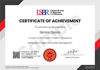
Sample Certificate
Preview the certificate you'll receive upon successful completion of this program.
Get Free Course Info
Enter your email and we'll send you the full course details, curriculum, and pricing information.
Is Your Employer Paying?
Many employers cover the cost of professional development. Request a corporate invoice and we'll handle everything — from enrolment to certification.
Trusted by 2,500+ Companies
From startups to Fortune 500 companies across 180+ countries.
What People Say About Us
Hear from our students about their experience with the Executive Development Programme in Creating Mobile-First Websites for All Devices at LSBR School of Professional Development.
Oliver Davies
United Kingdom"The course content was incredibly comprehensive, covering everything from responsive design principles to advanced mobile-first strategies. I gained practical skills that I could immediately apply to my projects, making me more confident in creating websites that perform well on all devices, which has already proven beneficial in my career."
Ashley Rodriguez
United States"The Executive Development Programme in Creating Mobile-First Websites for All Devices has been incredibly valuable for my career. I've gained practical skills that are directly applicable to my job, allowing me to create responsive and user-friendly websites that cater to all devices. This program has not only enhanced my technical abilities but also made me more confident in leading projects that prioritize mobile-first design, which has significantly improved my professional standing in the industry."
Rahul Singh
India"The course was exceptionally well-organized, with a clear progression from basic principles to advanced techniques, making it easy to follow even for those new to mobile-first design. The comprehensive content covered everything from responsive design to performance optimization, providing me with practical skills that I can immediately apply in my professional projects."
12 people are viewing this course right now