
Executive Development Programme in Responsive Design: Creating Adaptive Websites
This programme equips executives with skills to design and develop adaptive websites that respond seamlessly to various devices, enhancing user experience and business efficiency.
Executive Development Programme in Responsive Design: Creating Adaptive Websites
Programme Overview
The Executive Development Programme in Responsive Design: Creating Adaptive Websites is tailored for senior-level web professionals, digital marketers, and business leaders seeking to enhance their web design and development skills to meet the demands of a multi-device, multi-screen world. The programme is designed to equip participants with a deep understanding of responsive design principles, web accessibility, and user experience (UX) best practices, ensuring that learners can create adaptive websites that perform seamlessly across various devices and platforms.
Key skills and knowledge that learners will develop include a comprehensive grasp of responsive design frameworks, such as CSS Grid and Flexbox, and the ability to integrate these frameworks into web projects. Participants will also learn to optimize content for search engines, ensuring that websites are not only user-friendly but also visible on search results. The programme also covers advanced topics such as performance optimization techniques, server-side and client-side rendering, and the use of content delivery networks (CDNs) to enhance website speed and user engagement. By the end of the programme, learners will have the technical and strategic knowledge to lead or oversee the development of adaptive websites that meet the needs of a diverse user base.
This programme has a significant positive impact on careers, as participants will be better equipped to manage and lead digital transformation initiatives within their organizations. Graduates can expect to take on more strategic roles in web development, potentially leading teams or serving as key decision-makers in product development cycles. Enhanced skills in responsive design will also open up opportunities for higher-level positions in the technology sector, particularly
What You'll Learn
The Executive Development Programme in Responsive Design: Creating Adaptive Websites is a pioneering course designed to empower professionals with the skills needed to develop websites that seamlessly adapt to various devices and screen sizes. This program is ideal for executives, designers, and developers looking to stay ahead in the rapidly evolving digital landscape. By blending practical, hands-on workshops with theoretical insights, participants will learn to craft user-friendly, responsive web designs that enhance user experience and drive business success.
Key topics include the principles of responsive design, CSS techniques for layout adaptation, media queries for targeted styling, and the integration of web accessibility standards. Through case studies and real-world projects, graduates will gain practical experience in applying these concepts to create adaptive websites that meet the demands of a diverse user base. The program also emphasizes the importance of SEO, performance optimization, and cross-device consistency, ensuring that students are well-prepared to tackle the challenges of today's digital environment.
Upon completion, participants will be equipped to lead responsive design initiatives, enhance digital strategies, and contribute to the development of user-centric web applications. This program opens doors to advanced roles such as lead web designer, senior user experience designer, and responsive web development manager. Graduates will not only expand their professional skill set but also gain a competitive edge in the job market by mastering the art of creating adaptive websites that deliver exceptional user experiences across all devices.
Programme Highlights
Industry-Aligned Curriculum
Developed with industry leaders to ensure practical, job-ready skills valued by employers worldwide.
Globally Recognised Certificate
Recognised by employers across 180+ countries as a mark of professional excellence.
Flexible Online Learning
Study at your own pace with lifetime access to all course materials and updates.
Instant Access
Start learning immediately — no application process or waiting period required.
Constantly Updated Content
Stay ahead with the latest industry trends, best practices, and emerging insights.
Career Advancement
87% of graduates report measurable career progression within 6 months of completion.
Topics Covered
- 1. Introduction to Responsive Design: Learners will understand the basics of responsive design, including its importance and key principles. They will gain foundational skills in creating flexible layouts that adapt to different screen sizes.
- 2. Media Queries and CSS Flexibility: This module covers the use of media queries and CSS properties for creating flexible and adaptive layouts. Learners will practice writing responsive CSS code to ensure web pages look good on all devices.
- 3. HTML5 Semantics for Responsive Design: Learners will explore how to use HTML5 semantic elements to structure web pages in a way that is both accessible and adaptive. They will learn to create responsive documentation and content-rich pages.
- 4. Layout Techniques for Responsive Websites: This module focuses on various layout techniques such as grid systems, flexbox, and CSS grid. Learners will practice designing and implementing responsive layouts that can handle different content and screen sizes.
- 5. Images and Responsive Media: Learners will discover how to optimize images and other media for use in responsive designs. They will learn to use techniques like responsive images and adaptive media queries to enhance the user experience across devices.
- 6. JavaScript for Responsive Enhancements: This module introduces learners to JavaScript and its role in implementing dynamic and interactive responsive features. They will build simple scripts to enhance user interaction on responsive websites.
- 7. Testing and Debugging Responsive Websites: Learners will learn how to test and debug responsive websites across different devices and browsers. They will use tools and methods to ensure their designs are fully functional and user-friendly.
- 8. Performance Optimization for Responsive Websites: This module covers strategies for optimizing the performance of responsive websites. Learners will learn techniques to improve load times and reduce bandwidth usage without compromising the design.
- 9. Mobile Web Design Best Practices: Learners will study best practices for designing mobile-first websites. They will learn to prioritize elements, simplify navigation, and optimize touch interactions to create effective mobile experiences.
- 10. Creating Responsive E-commerce Websites: This advanced module focuses on designing and implementing responsive e-commerce websites. Learners will learn how to create a seamless shopping experience across devices, including mobile, tablet, and desktop.
Everything You Get With This Programme
Key Facts
Audience: Web developers, designers, UX specialists
Prerequisites: Basic HTML, CSS knowledge
Outcomes: Master responsive design techniques, build adaptive websites
Ready to Advance Your Career?
Join thousands of professionals who have transformed their careers with LSBR.
Enroll Now — $199Why This Course
Enhance Career Mobility: By mastering responsive design, professionals can expand their skill set, making them more versatile and attractive to a wider range of employers. This programme equips participants with the knowledge to create adaptive websites, a critical skill in today's digital landscape. Employers value candidates who can deliver user-friendly, accessible websites across various devices, offering a significant edge in the job market.
Boost Client Satisfaction: Clients expect websites that are not only aesthetically pleasing but also functional on all devices. This programme helps professionals develop the technical expertise needed to meet these expectations. By learning to design responsive websites, professionals can ensure that their clients' websites are accessible and engaging on smartphones, tablets, and desktops, thereby enhancing user experience and client satisfaction.
Future-Proof Your Skills: The digital realm is constantly evolving, and responsive design is at the forefront of this evolution. This programme not only teaches the latest techniques but also encourages a mindset of continuous learning. Professionals who complete this programme will be well-prepared to adapt to future changes in web design and technology, ensuring their skills remain relevant and valuable in the long term.
Estimated Completion
3-4 Weeks
Path to Certification
1. Enroll
Sign up and get instant access to all course materials.
2. Learn
Study at your own pace with expert-designed content.
3. Complete
Finish the programme in as little as 3-4 weeks.
4. Get Certified
Receive your industry-recognised certificate from LSBR.
Join Our Global Alumni Network
0
Graduates +
0
Career Growth %
0
Salary Increase %
0
Countries +
Course Brochure
Download our comprehensive course brochure with all details
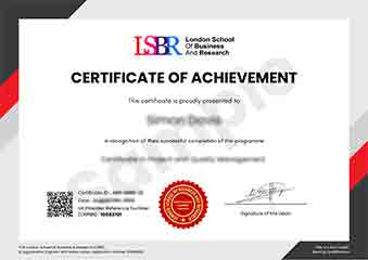
Sample Certificate
Preview the certificate you'll receive upon successful completion of this program.
Get Free Course Info
Enter your email and we'll send you the full course details, curriculum, and pricing information.
Is Your Employer Paying?
Many employers cover the cost of professional development. Request a corporate invoice and we'll handle everything — from enrolment to certification.
Trusted by 2,500+ Companies
From startups to Fortune 500 companies across 180+ countries.
What People Say About Us
Hear from our students about their experience with the Executive Development Programme in Responsive Design: Creating Adaptive Websites at LSBR School of Professional Development.
James Thompson
United Kingdom"The course content was incredibly comprehensive, covering all the nuances of responsive design that are crucial for creating adaptive websites. I left the program with a solid set of practical skills that have already improved my ability to design websites that look great on any device."
Kai Wen Ng
Singapore"This course has been instrumental in enhancing my ability to create responsive designs that adapt seamlessly across various devices, making my portfolio more industry-relevant and boosting my career prospects in web development."
Madison Davis
United States"The course structure was well-organized, providing a clear progression from foundational concepts to advanced techniques in responsive design, which greatly enhanced my understanding and practical skills in creating adaptive websites. The comprehensive content and real-world applications have been invaluable for my professional growth, equipping me with the knowledge to tackle complex design challenges effectively."
12 people are viewing this course right now