
Professional Certificate in Designing User-Friendly Reporting Interfaces
Elevate your skills in creating intuitive, user-friendly reporting interfaces with this professional certificate, enhancing data accessibility and user satisfaction.
Professional Certificate in Designing User-Friendly Reporting Interfaces
Programme Overview
The Professional Certificate in Designing User-Friendly Reporting Interfaces is a comprehensive program tailored for professionals in data analytics, business intelligence, and data visualization roles, as well as those looking to enhance their skills in creating intuitive and effective reporting interfaces. This program systematically covers the design principles and best practices essential for developing reporting interfaces that are not only visually appealing but also highly functional and user-friendly. Learners will gain hands-on experience using industry-standard tools and techniques, and will understand the importance of user experience (UX) and user interface (UI) design in the context of data reporting.
Key skills and knowledge developed through this program include the ability to design and implement interactive dashboards, create visualizations that effectively communicate complex data, and apply principles of human-computer interaction to ensure users can easily interpret and act on the information presented. Participants will learn to use tools such as Tableau, Power BI, and other data visualization software, as well as gain a deep understanding of the data storytelling process, which is crucial for engaging and educating diverse audiences.
The program will significantly impact participants' career trajectories by equipping them with the skills necessary to design user-friendly reporting interfaces that drive decision-making and improve organizational performance. Graduates will be well-prepared to take on leadership roles in data visualization, data analytics, and business intelligence, or to enhance their current roles by integrating user-centric design principles into their work. The ability to create clear and effective reporting interfaces is highly valued in today’s data-driven business environment, making this
What You'll Learn
The Professional Certificate in Designing User-Friendly Reporting Interfaces is a comprehensive, hands-on program designed to empower professionals with the skills necessary to create intuitive, accessible, and effective reporting interfaces. This program is ideal for data analysts, business intelligence specialists, and software developers who seek to enhance user engagement and improve data comprehension through well-designed interfaces.
Key topics include user-centered design principles, data visualization techniques, interactive dashboard creation, usability testing, and accessibility standards. Participants will learn to apply these concepts using industry-standard tools and technologies, such as Tableau, Power BI, and JavaScript libraries like D3.js.
Upon completion, graduates will be equipped to design and develop robust reporting interfaces that not only enhance user experience but also drive business insights and decisions. They will be able to collaborate effectively with cross-functional teams, ensuring that reporting interfaces meet both technical and user needs.
This program opens doors to a variety of career opportunities, including roles such as Data Visualization Specialist, Business Intelligence Developer, and User Experience Designer. Graduates can also pursue advanced certifications or further educational opportunities in data science, human-computer interaction, or software engineering. By mastering the art of designing user-friendly reporting interfaces, professionals can significantly enhance their value in the data-driven workplace, transforming raw data into actionable intelligence that drives success.
Programme Highlights
Industry-Aligned Curriculum
Developed with industry leaders to ensure practical, job-ready skills valued by employers worldwide.
Globally Recognised Certificate
Recognised by employers across 180+ countries as a mark of professional excellence.
Flexible Online Learning
Study at your own pace with lifetime access to all course materials and updates.
Instant Access
Start learning immediately — no application process or waiting period required.
Constantly Updated Content
Stay ahead with the latest industry trends, best practices, and emerging insights.
Career Advancement
87% of graduates report measurable career progression within 6 months of completion.
Topics Covered
- 1. Introduction to User-Centered Design: Learners will explore foundational concepts of user-centered design, including user needs, personas, and scenarios. They will gain skills in conducting user research and creating empathy maps to understand user requirements.
- 2. Principles of Visual Communication: This module covers fundamental principles of visual communication, such as color theory, typography, and layout design. Learners will develop skills in creating clear and effective visual designs that enhance the usability and aesthetic appeal of reporting interfaces.
- 3. Data Visualization Techniques: Learners will study various data visualization techniques, including charts, graphs, and infographics. They will practice selecting and applying appropriate visualization methods to represent data effectively, ensuring that reporting interfaces are intuitive and insightful.
- 4. Interaction Design for Reporting Interfaces: This module focuses on designing interactive elements within reporting interfaces, such as filters, drill-downs, and tooltips. Learners will learn how to create engaging and responsive interactions that enhance user experience.
- 5. Accessibility and Inclusion in Design: Learners will delve into the principles of accessible design, including compliance with WCAG guidelines. They will gain skills in designing interfaces that are inclusive and usable by people with disabilities.
- 6. Advanced Data Exploration Techniques: This module covers advanced data exploration techniques, such as data mining, predictive analytics, and machine learning. Learners will learn how to incorporate these techniques into reporting interfaces to provide deeper insights and predictive capabilities.
- 7. Interaction Design Patterns and Best Practices: Learners will study common interaction design patterns and best practices for reporting interfaces. They will practice applying these patterns to design solutions that are consistent, efficient, and effective.
- 8. Prototyping and Usability Testing: This module focuses on prototyping tools and methods for usability testing. Learners will gain skills in creating interactive prototypes and conducting user testing to gather feedback and iterate on their designs.
- 9. Mobile Design for Reporting Interfaces: Learners will explore the unique challenges and opportunities of designing reporting interfaces for mobile devices. They will learn how to create responsive designs that provide a seamless user experience across various screen sizes and orientations.
- 10. Implementation and Deployment of Reporting Interfaces: This final module covers the practical aspects of implementing and deploying reporting interfaces. Learners will learn how to integrate their designs with existing systems, ensure compatibility with different platforms, and maintain the interfaces over time.
Everything You Get With This Programme
Key Facts
For professionals in data analysis, UX design
No formal prerequisites required
Learn to design intuitive, user-friendly reports
Enhance data visualization skills
Understand user-centric design principles
Ready to Advance Your Career?
Join thousands of professionals who have transformed their careers with LSBR.
Enroll Now — $149Why This Course
Enhanced Skill Set: Acquiring a Professional Certificate in Designing User-Friendly Reporting Interfaces equips professionals with a robust set of skills in interface design, data visualization, and user experience (UX) principles. This certification can significantly enhance a professional's ability to create intuitive and effective data reports, thereby improving user satisfaction and productivity.
Competitive Edge: In a rapidly evolving job market, professionals with specialized certifications like this one are more likely to stand out. Employers often seek candidates who can demonstrate proficiency in specific tools and methodologies. A certificate in user-friendly reporting interfaces not only showcases expertise in these areas but also indicates a commitment to staying current with industry standards.
Improved Career Opportunities: With a certificate in user-friendly reporting interfaces, professionals can open doors to new career paths and roles that require advanced proficiency in data analysis and reporting. For instance, candidates can transition into roles such as data analyst, business intelligence analyst, or UX designer, where the ability to create clear, accessible reports is crucial.
Better Business Outcomes: Understanding and implementing best practices in designing user-friendly reporting interfaces can lead to better decision-making within organizations. By creating reports that are easy to understand and navigate, professionals can help reduce the time and effort required for stakeholders to make informed decisions, potentially leading to more efficient operations and improved business outcomes.
Estimated Completion
3-4 Weeks
Path to Certification
1. Enroll
Sign up and get instant access to all course materials.
2. Learn
Study at your own pace with expert-designed content.
3. Complete
Finish the programme in as little as 3-4 weeks.
4. Get Certified
Receive your industry-recognised certificate from LSBR.
Join Our Global Alumni Network
0
Graduates +
0
Career Growth %
0
Salary Increase %
0
Countries +
Course Brochure
Download our comprehensive course brochure with all details
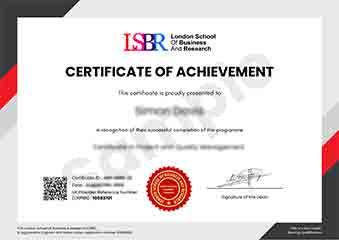
Sample Certificate
Preview the certificate you'll receive upon successful completion of this program.
Get Free Course Info
Enter your email and we'll send you the full course details, curriculum, and pricing information.
Is Your Employer Paying?
Many employers cover the cost of professional development. Request a corporate invoice and we'll handle everything — from enrolment to certification.
Trusted by 2,500+ Companies
From startups to Fortune 500 companies across 180+ countries.
What People Say About Us
Hear from our students about their experience with the Professional Certificate in Designing User-Friendly Reporting Interfaces at LSBR School of Professional Development.
Sophie Brown
United Kingdom"The course content was incredibly thorough and well-structured, providing a solid foundation in designing intuitive reporting interfaces. I gained practical skills that have directly improved my ability to create user-friendly dashboards, which I believe will be invaluable in my career."
Klaus Mueller
Germany"This course has been instrumental in enhancing my ability to design intuitive and effective reporting interfaces, directly translating into more efficient and user-friendly solutions for my team. It has significantly boosted my career prospects by equipping me with industry-standard tools and best practices that are highly sought after in the tech sector."
Tyler Johnson
United States"The course structure was meticulously organized, providing a clear path from basic principles to advanced concepts in designing user-friendly reporting interfaces, which significantly enhanced my understanding and practical skills in the field. The comprehensive content and real-world applications ensured that I could apply what I learned directly to improve existing systems and innovate new ones."
12 people are viewing this course right now