
Professional Certificate in Grid-Based Responsive Design: Practical Applications
Implement effective grid-based responsive design: practical applications strategies that drive organizational excellence. Learn from industry best practices.
Professional Certificate in Grid-Based Responsive Design: Practical Applications
Programme Overview
This course is for web designers and developers eager to master grid-based responsive design. First, you will dive into the fundamentals of CSS Grid. Then, you will explore practical applications. Meanwhile, you will learn to create flexible, responsive layouts adaptable to various devices.
Next, you will tackle real-world projects. After completing this course, you will gain hands-on experience in designing and developing responsive websites. You will also have a professional certificate showcasing your skills. Ultimately, this course equips you to build modern, responsive web experiences.
What You'll Learn
Embark on a transformative journey with our 'Professional Certificate in Grid-Based Responsive Design: Practical Applications.' First, you'll dive into the fundamentals of grid-based design. Next, you'll master responsive techniques that ensure your designs look stunning on any device. Through hands-on projects and real-world case studies, you'll gain practical experience. Moreover, you'll learn to optimize user experience, making your designs both functional and visually appealing. Upon completion, you'll be equipped with skills highly sought after in the job market. Furthermore, you'll open doors to exciting career opportunities in web design, UI/UX design, and front-end development.
In addition, our course features expert-led tutorials and a supportive community. Therefore, you'll never feel alone in your learning journey. Enroll now and take the first step towards becoming a responsive design expert.
Programme Highlights
Industry-Aligned Curriculum
Developed with industry leaders to ensure practical, job-ready skills valued by employers worldwide.
Globally Recognised Certificate
Recognised by employers across 180+ countries as a mark of professional excellence.
Flexible Online Learning
Study at your own pace with lifetime access to all course materials and updates.
Instant Access
Start learning immediately — no application process or waiting period required.
Constantly Updated Content
Stay ahead with the latest industry trends, best practices, and emerging insights.
Career Advancement
87% of graduates report measurable career progression within 6 months of completion.
Topics Covered
- Introduction to Grid-Based Design: Understand the basics of grid-based design and its importance in responsive web design.
- Setting Up the Development Environment: Learn how to set up the necessary tools and environment for grid-based responsive design.
- Creating Flexible Layouts with CSS Grid: Implement flexible and responsive layouts using CSS Grid techniques.
- Advanced Grid Techniques: Explore advanced CSS Grid features for complex and dynamic layouts.
- Responsive Images and Media Queries: Ensure images and media are responsive using media queries and modern techniques.
- Practical Applications and Case Studies: Apply grid-based design principles to real-world projects through case studies and hands-on exercises.
Everything You Get With This Programme
Key Facts
Audience: This course is for web designers, developers, and digital creators who want to enhance their skills. It is also suitable for beginners who are curious about learning responsive design.
Prerequisites: First, have basic knowledge of HTML and CSS. Next, familiarize yourself with web design concepts. Finally, be comfortable using a code editor.
Outcomes: First, you will learn to design responsive websites using grids. Then, you will understand how to create flexible layouts. Finally, you will gain practical experience with real-world projects.
Ready to Advance Your Career?
Join thousands of professionals who have transformed their careers with LSBR.
Enroll Now — $149Why This Course
Learn responsive design with practical skills. Enroll in this course. First, gain hands-on experience. Build real-world projects. Next, master grid systems. Learn to create layouts for different devices. Finally, receive professional certification. Showcase your skills. Stand out as a qualified designer.
Estimated Completion
3-4 Weeks
Path to Certification
1. Enroll
Sign up and get instant access to all course materials.
2. Learn
Study at your own pace with expert-designed content.
3. Complete
Finish the programme in as little as 3-4 weeks.
4. Get Certified
Receive your industry-recognised certificate from LSBR.
Join Our Global Alumni Network
0
Graduates +
0
Career Growth %
0
Salary Increase %
0
Countries +
Course Brochure
Download our comprehensive course brochure with all details
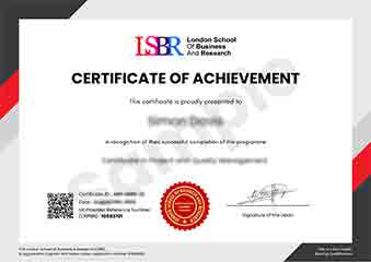
Sample Certificate
Preview the certificate you'll receive upon successful completion of this program.
Get Free Course Info
Enter your email and we'll send you the full course details, curriculum, and pricing information.
Is Your Employer Paying?
Many employers cover the cost of professional development. Request a corporate invoice and we'll handle everything — from enrolment to certification.
Trusted by 2,500+ Companies
From startups to Fortune 500 companies across 180+ countries.
What People Say About Us
Hear from our students about their experience with the Professional Certificate in Grid-Based Responsive Design: Practical Applications at LSBR School of Professional Development.
Sophie Brown
United Kingdom"The course content was incredibly comprehensive, covering everything from the basics to advanced techniques in grid-based responsive design. I gained practical skills that I could immediately apply to my projects, which has significantly boosted my confidence and employability in the field."
Priya Sharma
India"This course has been a game-changer for my career. I've gained hands-on experience with grid-based responsive design, which has made my work more efficient and my designs more versatile. The practical applications I learned have directly translated into better job opportunities and a stronger professional reputation in the industry."
Jack Thompson
Australia"The course structure was exceptionally well-organized, with each module building seamlessly on the previous one, which made complex topics in grid-based responsive design much more digestible. The comprehensive content and real-world applications provided have significantly enhanced my professional growth, equipping me with practical skills that I can immediately apply to my projects."
12 people are viewing this course right now